
Bolingbroke Grove reaches practical Completion
We transformed this Victorian terraced house by replacing a dated existing rear ground-floor extension and enlarging the basement. The design of the kitchen was central to this project with the details being key to achieve the result that the clients wanted.
The brief
The client’s main priority was to create a large, light open-plan kitchen/dining and living space to the rear of the house, overlooking the large, pretty garden. This space was to incorporate an existing separate dining room and would be the main living space for the family of 5. Another priority was enlarging and better connecting the basement to the rest of the house.
Our response to the brief
In order to achieve the requirements, we completely remodelled the ground floor, leaving only the front drawing room as existing. The existing isolated staircase down to the basement, that was closed off by a door, was removed and instead we continued the main stairs of the house down into the basement. The staircase was widened and a larger void created in order to give a much stronger connection between the basement and the ground floor.
This addressed the issue of the disconnected and closed off basement that the clients felt was underused. Connecting the main stairs to the basement, not only allowed natural light down into the basement hall from the ground entrance hall but also incorporated this floor into the rest of the house.
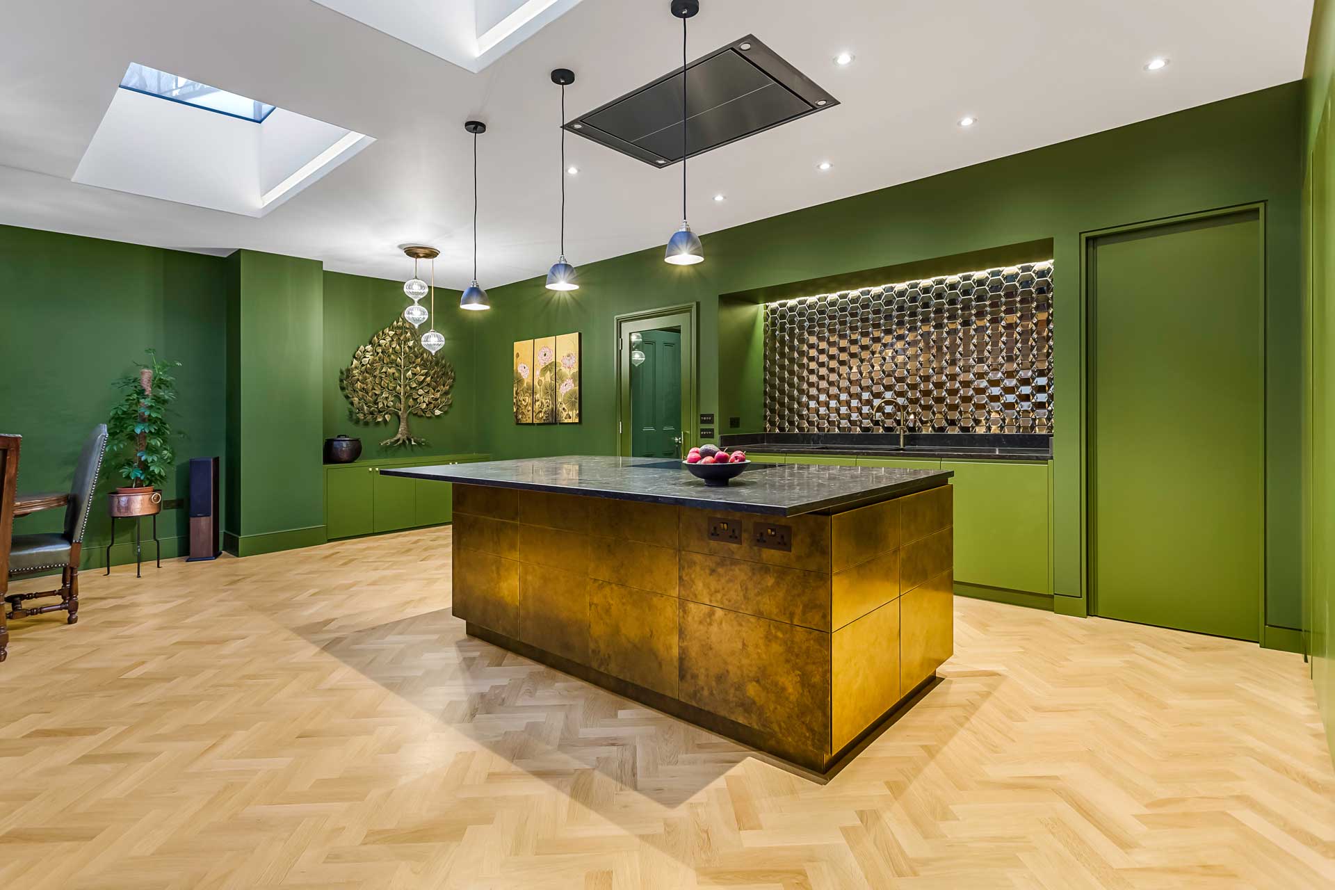
At the rear of the ground floor, we created a large, light filled space in place of the existing kitchen and dining area. This room became the focus of the project and in particular the kitchen.
The kitchen design
The main feature of the new space created to be the hub of the home, was the kitchen.
The client was very keen to have a kitchen that didn't look like a kitchen, as it was in a space where dinner parties would be hosted and the family would live day to day therefore it was important that it felt much more like a living area and not simply a kitchen.
For this reason, a good sized pantry was created to house the more functional aspects and allow the kitchen to be kept more minimal.
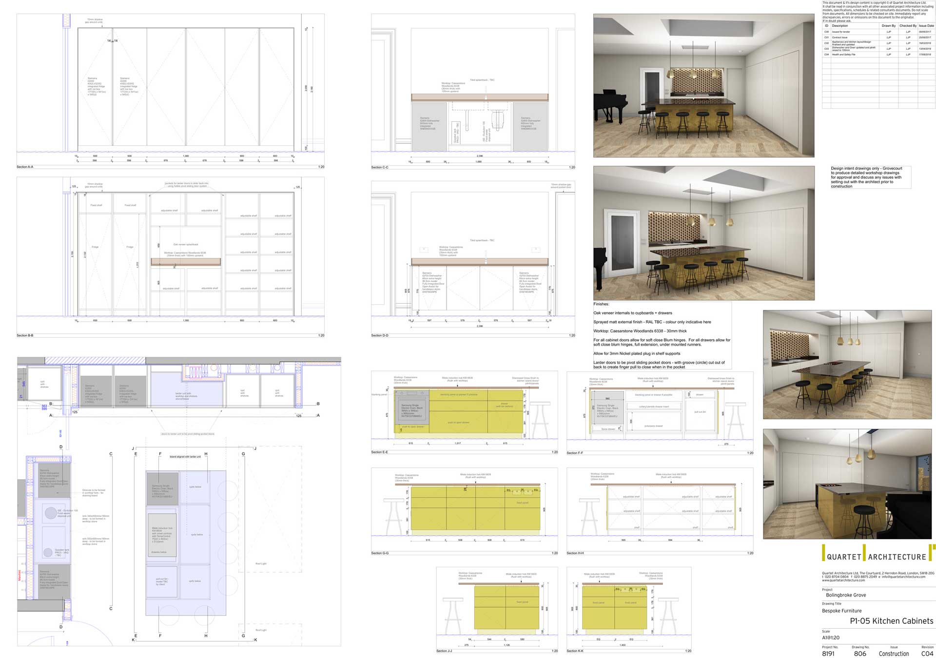
We designed and detailed the kitchen and Grovecourt Ltd manufactured, coordinated the specialist finishes and installed it.
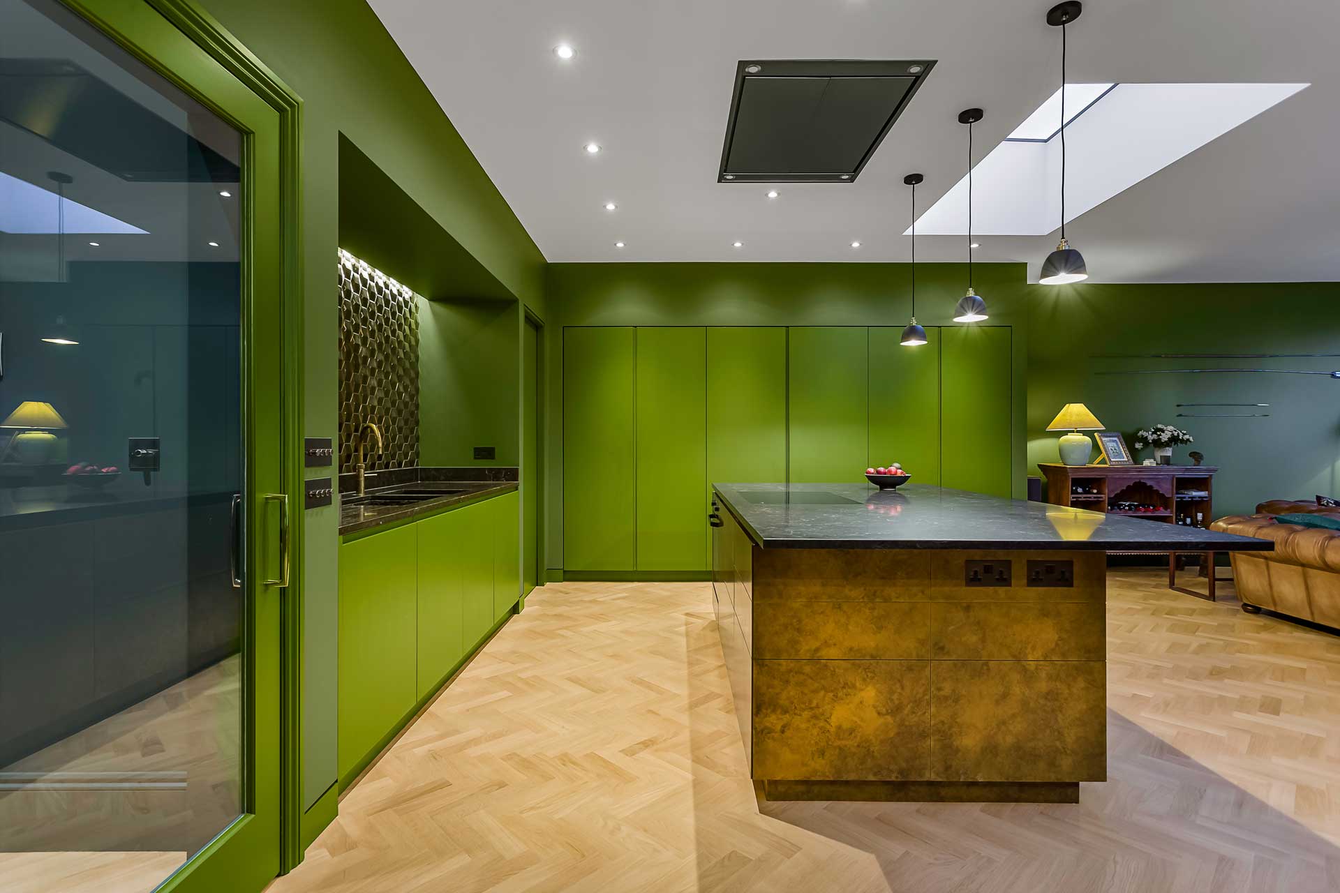
A wall of tall handle-less cupboards housing a larder and two fridges was built into an alcove and sprayed the same colours as the walls - in order to blend in - as were the units below the sink.
The client chose a feature metallic gold 3D tile as the sink splash back, which we top lit. This tile creates a feature wall and brings a sense of luxury and warmth to a typically functional space - more akin to a living room or bar area.
The island was designed to be the feature of the kitchen and stood out against the rest of the kitchen which was very much designed to be 'lost' and not stand out. For the island the client wanted a metallic finish - which coordinated with the tiles and with the intention of the island becoming almost sculptural in the space and a thing of beauty.
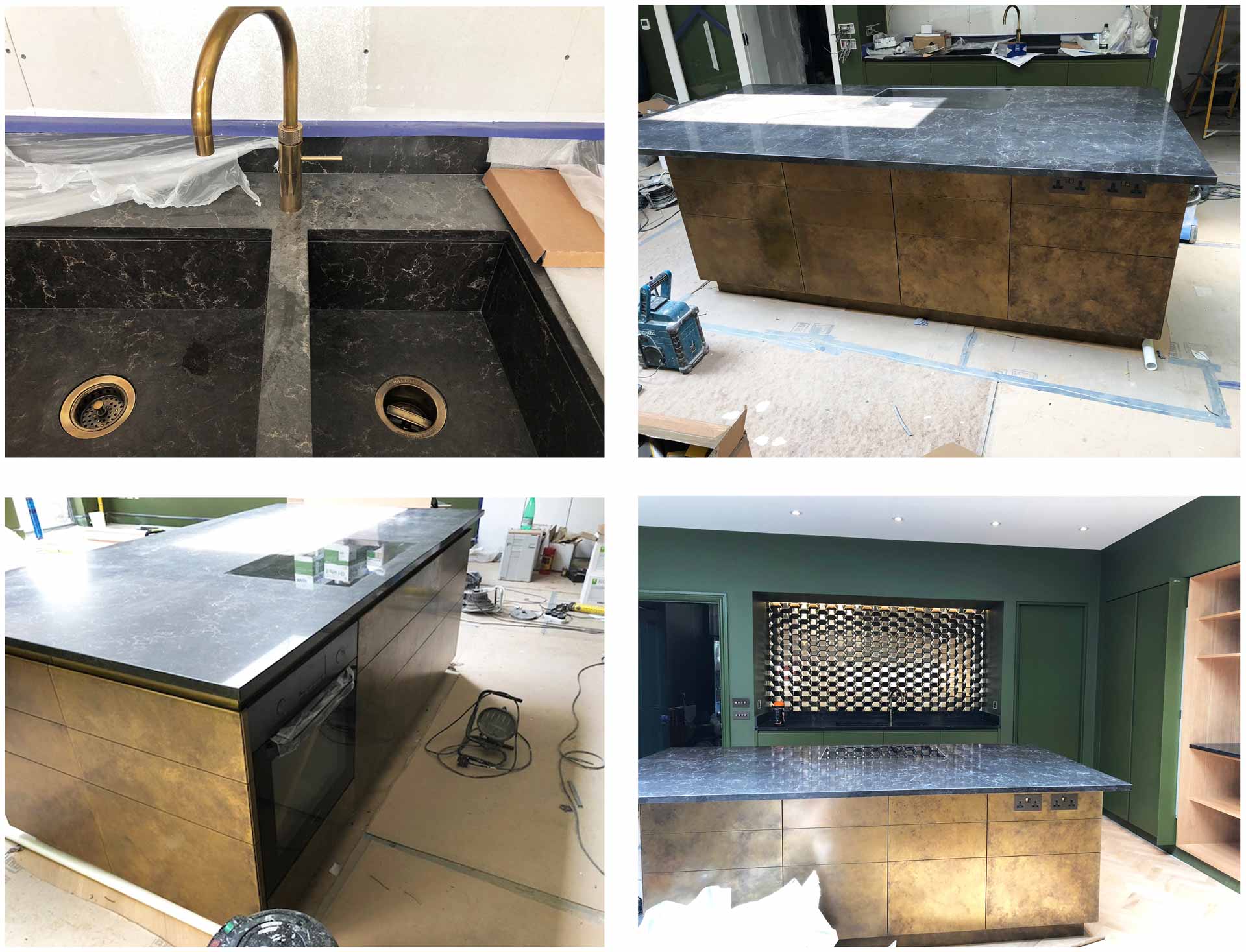
The specialist sprayed liquid brass was applied by Metall-FX to all of the doors and carcass of the island unit. This offered a very effective, flexible and durable solution that achieved the look the client wanted. The colour and patina to the brass finish was bespoke for this project, as it was done by hand and was developed through many samples.
It was important not to have any stainless steel or chrome fittings in the kitchen alongside the brass. Therefore the Quooker tap and plugs all had a specialist coating applied to match this antique brass finish. Likewise, we specified all ironmongery and faceplates in a brass/bronze finish to compliment the kitchen.
We also sourced an all-black oven that was fitted in the side of the island facing the sink - so as to remain out of sight.
The choice of the olive green colour for the walls and kitchen units by the client, helped to make the kitchen appear less kitchen like and made a bold statement. It proved that a kitchen does not need to be white in order to be minimal. To work with this colour we sourced a dark brown marble effect quartz worktop, which picked up on the warm gold accents in the kitchen.
The final result
We feel that the brief of designing a kitchen to not look like a kitchen was achieved through careful material selection and meticulous detailing in order to make it appear minimal and remove any overtly functional aesthetic. The result is a warm and inviting kitchen that is very much an extension of the whole living space instead of being clearly defined and separate.
Using the Metall-FX sprayed liquid brass meant that we could apply this to small shadow gaps and finger groove details, meaning that it did not dictate the details that we wanted to achieve. It also provided a more durable finish for the client than simply cladding the carcass in sheet metal.
The clients are delighted with the kitchen and indeed the overall project.